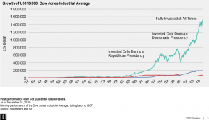
In our last blog post we explored stock market performance based on who is in the Oval Office, a Republican or Democrat. Surprisingly, the average annual returns over the past 82 years turned out to be very similar. We came across another graph that emphasizes this point and shows the advantage of staying invested in the stock market over the long-term.
Despite economic setbacks, history shows that the stock market trends upward. The attached chart from AllianceBerstein illustrates the growth of $10,000 invested in the Dow Jones Industrial average since 1937. The blue line represents an investor who kept their money in the market exclusively during Democratic presidencies while the red line shows one who stayed invested only during the Republican terms. The teal line represents someone fully invested during all presidencies, Democratic and Republican. While the red and blue lines trend upward, it’s clearly visible that the teal line dwarfs them over time.
Trying to “time the market” by moving money out of stocks is tempting, especially during times of high uncertainty. The stock market has had fantastic years when Democrats control the White House, and when Republicans are in charge. It is important to be invested when these years occur. We recommend that our clients focus on “time in the markets” versus moving in and out based on political or other factors.
If you have any questions about the economic impact of this year’s election or any other topic, please don’t hesitate to contact us at Modus Advisors.


